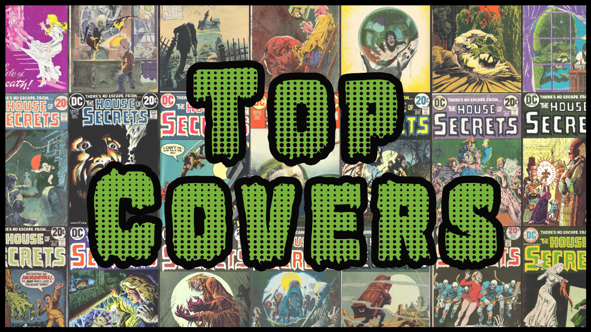
I’m starting a new format of blog posts that highlights my favorite covers from series. Comic covers are such an important part of the medium it made sense to me to just shine a light on some really amazing art. The number of covers I feature will depend on the length of the series. I’ll move through them in countdown format, with my absolute favorite being last. House of Secrets seemed like a great place to start and had a lengthy run through the 70s and 80s. As you will see, most of my picks are from the earlier part of the run. Let’s get started.
10.
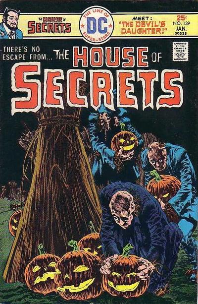
Issue 139, art by Bernie Wrightson. Looking through all of the covers from the series, I noticed a pretty steady decline in quality. Over the years the lines got simpler, the ideas more one dimensional. This cover caught my eye though. The lit Jack-o’-lanterns immediately stand out against the bold blacks in the background. Then you start to identify the humans aren’t really human at all. I can’t tell you what they are outside of very creepy. Of course it was drawn by Wrightson, one of the best at telling an entire story in a single image.
9.

Issue 86, art by Neal Adams. I just found this cover disturbing. I’m still speculating on what has happened here. Did the old man commit suicide? Was he murdered? The puppet is the opposite of sinister here, he is crying. In fact, there is nothing evil present here. Just the apparent loss of life with many confused supporting characters. Neal Adams will appear the most in this list, he had a real talent for drawing scared children witnessing horrors which House of Secrets took full advantage of.
8.

Issue 97, art by Jack Sparling. This cover was a very unique take on a gothic haunted castle. There was an incredible trend at the time of painted covers by star artists which really makes each one feel different. There were a lot of elements that stood out to me here. The mustard yellow colors are untraditional. The lumbering monster with a menacing ball and chain approaching the castle. And then the spirit or interpretation of a woman in terror. It is more intriguing because she isn’t directly present body on the cover.
7.
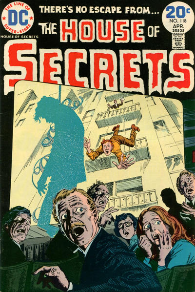
Issue 118, art by Luis Dominguez. A simple dark concept done very well. The audience is watching the actor fall on screen when suddenly the shadow of a man hanging is cast on that very screen. You can see the terror drawn so well on each individual member of the audience’s faces. The story inside might be very different but I’ve already created one in my head.
6.
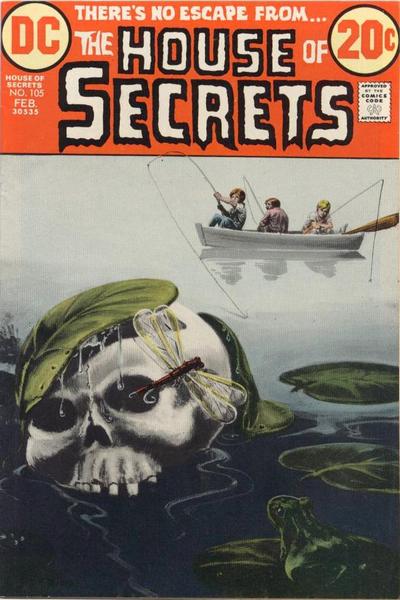
Issue 105, art by Jack Sparling. Another painted cover that is so bold and simple but effective. Three young children innocently fishing on a foggy day when something sinister lurks closely nearby. Some subtle details that make it surreal. Skulls usually sink, but this one seems to have risen up and lifted the lily pad. I also appreciate that frog looking at the skull with curiosity.
5.
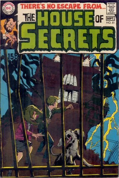
Issue 81, art by Neal Adams. The premiere cover for the series as it got rebranded for horror anthology and it is a great one. Neal Adams brings his best with a haunted house that has taken on the traits of a monster and come alive. Or is it just the children’s interpretation of the stormy night? The terror on the dog’s face really sells this one for me.
4.
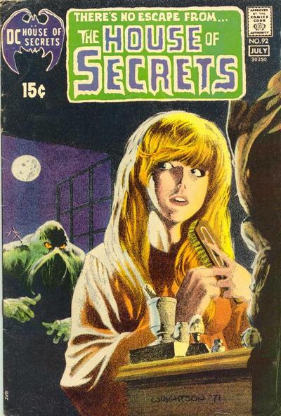
Issue 92, art by Bernie Wrightson. Bernie’s painted cover here is one of the most iconic from the Bronze Age. You don’t always get the first appearance of a character on a cover but when it matches up it is special. Swamp Thing couldn’t look more terrifying here as he approaches the innocent young woman as she begins to suspect something menacing is approaching.
3.
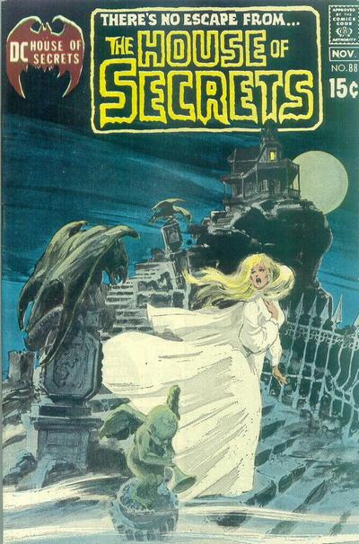
Issue 88, art by Neal Adams. There were a lot of gothic painting covers of a young woman running in terror with a fantastic castle or mansion in the background from this era. This one is my favorite from this series, I just think it tells an interesting story with the disturbing gargoyles and statues and the single lit room at the top of the house. The colors are also striking, the white dress against the midnight blue sky and a full moon.
2.
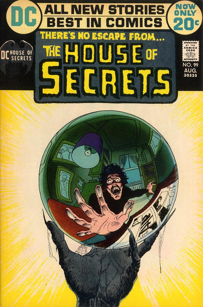
Issue 99, art by Mike Kaluta. Wow this cover stands out against all others. I have never seen anything else like it. A man seemingly trapped inside a crystal ball and terrified, held by a disturbing hand watching in. The bold shining light hides the identity and leaves the reader guessing who is holding this man’s life in front of them.
1.
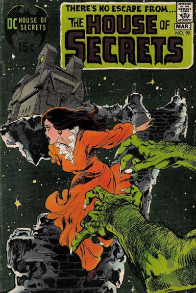
Issue 90, art by Neal Adams. I believe this is my favorite 70s horror comic cover period. It captures an existential dread with the cosmic background. It is one thing for the woman to be fleeing danger in a grounded gothic castle. It is something else entirely to escape the doors of the keep to then realize you are in the infinite expanse of space and the creature chasing you is not even of this Earth. Neal Adams beautifully draws this young woman but I just love the composition overall.

Leave a comment